
 Suomeksi


As participants of the Print Design course of this autumn, we were given a task by our lecturer Carita Forsgren to create a useful little booklet for the new media students arriving next year. Our class consisting of 25 people (both IMP degree students and exchange students) was first divided into three groups based on our major topics in the booklet: "Getting around", "Culture" and "Student life". As you probably can imagine, these chapters feature information on how to move about in Tampere, what kind of cultural aspects there are to Finland and what are the highlights of being a student here.
In the three smaller groups the text content for each chapter was made efficiently and quickly. Another benefit of division into smaller groups was that problems could be handled and discussed more easily. The point of this whole task was to be an example of problem-based learning, which in my opinion worked well.
 |
| The astonishing cover art of the booklet (left) and the mini-map (right) |
After a little more than a month, I dare say we came up with a very decent booklet for the upcoming IMPs. Basically each individual on the course was working on one page of their own creation with certain guidelines to follow.
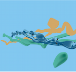
One of these guidelines was a monochromatic color scheme to be used in the illustrations to connect each chapter visually. The base colors for these graphics actually follow colors used in the TAMK logo.
 |
| Monochromatic style found inside the booklet |
After fine-tuning and exporting the booklet into a pdf-file, it was sent to Pekka Lähde and Paino-Arra for printing. The results that followed were amazing both in the booklet and the foldable mini-map that is supplied within the booklet.
I personally want to thank each and every talented and driven person that participated in the making of this booklet. Our hard work came out a huge success, most definitely.